During a focused and strategic process, we developed a new visual language that communicates trust and value. We crafted an elegant yet accessible color palette that combines softness with confidence. We refined the typography, built templates for marketing materials, and established brand guidelines to ensure consistency moving forward.
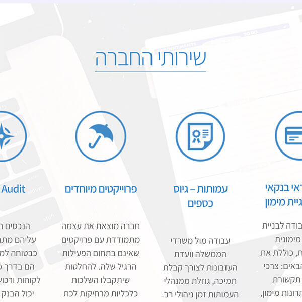
We selected colors that convey stability and presence, chose typography that’s quiet yet decisive, and maintained a minimalist approach that puts content at the center while supporting it with every visual element. We designed advertisements, digital marketing materials, and built a new website in the brand’s visual identity – all crafted to serve Ezuz Consultants’ goals: to stand out, express professionalism, and deliver their message clearly and confidently.
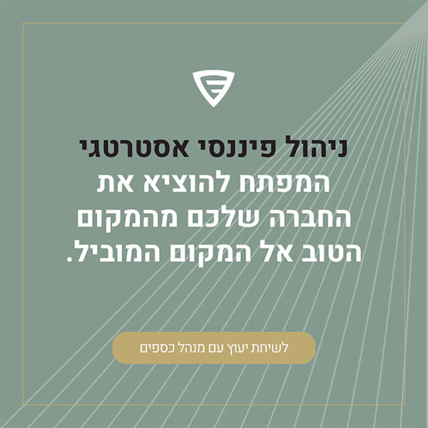
Our chosen palette – olive green, white, black, and gold – wasn’t selected randomly. Olive green brings a sense of grounding, calmness, and reliability. Black adds depth and presence. Gold introduces a precise touch of premium quality, while white balances everything – giving space to breathe, sharpening and illuminating the message.
This combination creates a distinctly premium feel without being alienating. It maintains accessibility through clean, simple language that communicates Ezuz Consultants’ professionalism effortlessly. Additionally, the colors were selected with careful attention to contrast and readability, ensuring everything works functionally as it should.
A rebrand that builds upon their existing identity but takes it several steps forward. One that doesn’t shout – but has presence. One that communicates confidently: we’re here, and we know what we’re doing.
Alongside the visual work, we produced a dedicated video shoot for a series of short videos featuring Ofer Ezuz. The goal was clear: enable him to share the knowledge and experience he’s accumulated – in the most genuine and direct way possible. No masks, no scripted text. Just Ofer, speaking authentically.
This rebranding project demonstrates how strategic visual refinements can elevate a business’s perception while maintaining its core identity and values.